Meet the Designers
Lifestyle | Community

The design of Lock29’s distinctive brand and the architectural design of the destination itself has been created by tunerbates design & architecture. Turnerbates is a vibrant, talented and multi-disciplinary studio, committed to delivering quality, client focused and cost-effective design and communication solutions. Turnerbates and the Lock29 team worked together to develop the concept of creating an exciting, versatile regeneration project in the heart of Banbury.
Turnerbates work on a diverse range of schemes, both home and abroad and we are so pleased to have them as partners on this incredible project. We spoke to the team to find out more about both the brand development architectural design for Lock29.

THE BRAND
Our brand is situated on the lock-side of the Oxford canal; on the Lock numbered 29. Lock29 is a historical part of the canal linking Bedworth, Banbury and Rugby. Completed in 1790, and further connecting to the River Thames and the Grand Union Canal — it became a main artery of trade between the Midlands and London for over 15 years and enhanced local county economies through strength of connectivity and shipping products of local industry. Three centuries later the Lock29 destination that we proudly offer pays homage to it’s heritage - connectivity, industrial roots and community benefits are our ethos. Logo design and branding is aimed at showing an edgy and modern feel but with an industrial vibe that appeals to all demographics.
All visitors and businesses are welcome to come and share our exciting space and help contribute to a better future based around our core values. Be it more sustainable, or more open, or more support and encouragement for community projects and others ideas.

The logo typeface nods to the roots of Banbury’s diverse history. It is edgy, industrial and raw.
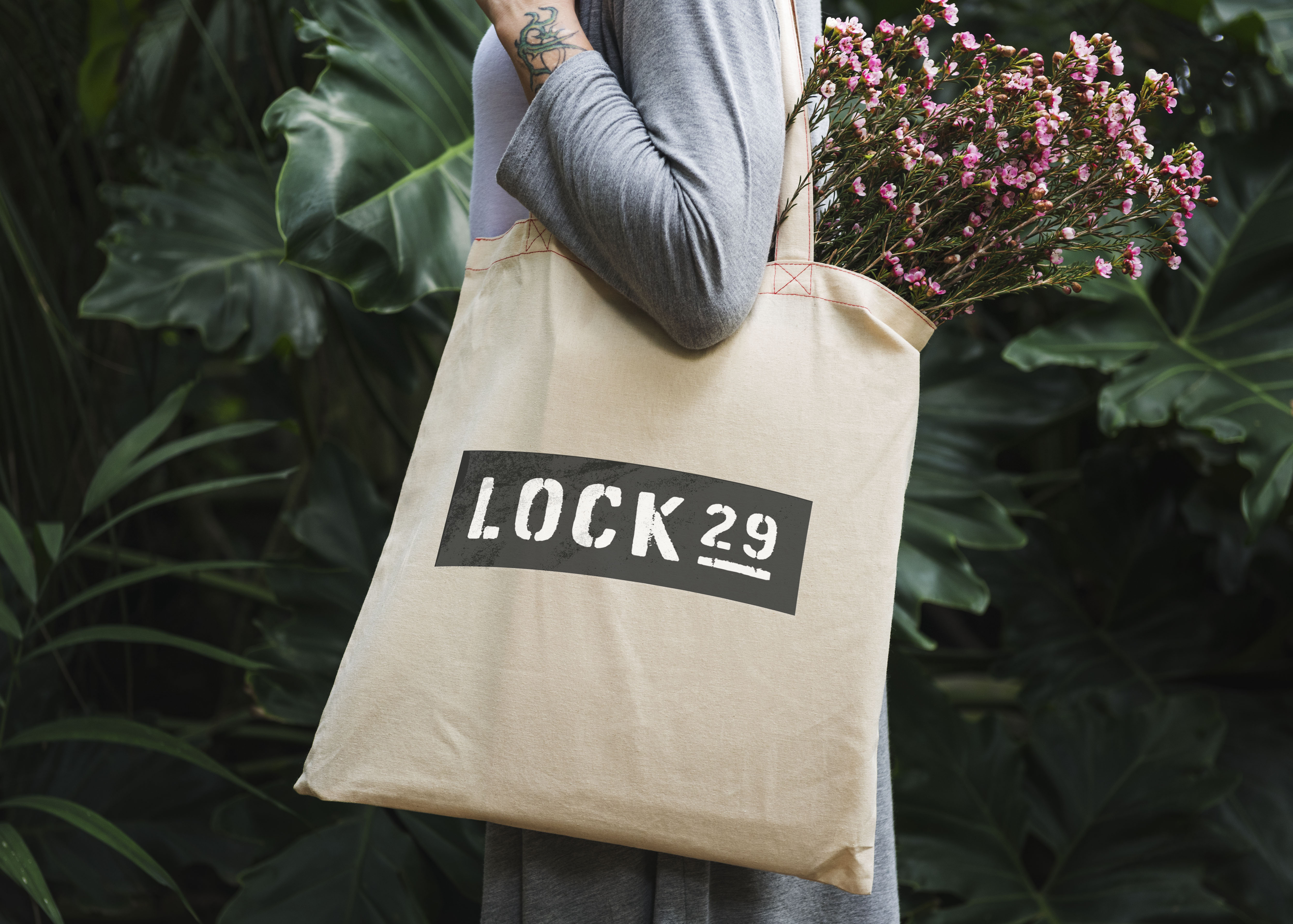
Urban font and gritty design is key for Lock29 and our associated branding - The eroded font and iron oxide backing (‘rusty metal’ to a hard working ferryman shipping coal along the Oxford Canal) is deliberately set to proudly show the industrial roots of the community. The logo itself references the historic lock numbering plaques that have been a means of navigation along the canal side for both those on foot or by boat person for centuries.
The branding captures the sweat and tears of the local area and a community grafting to help each other; a community of people trying to make a living; a community of people helping one another; innovating.
THE SPACE
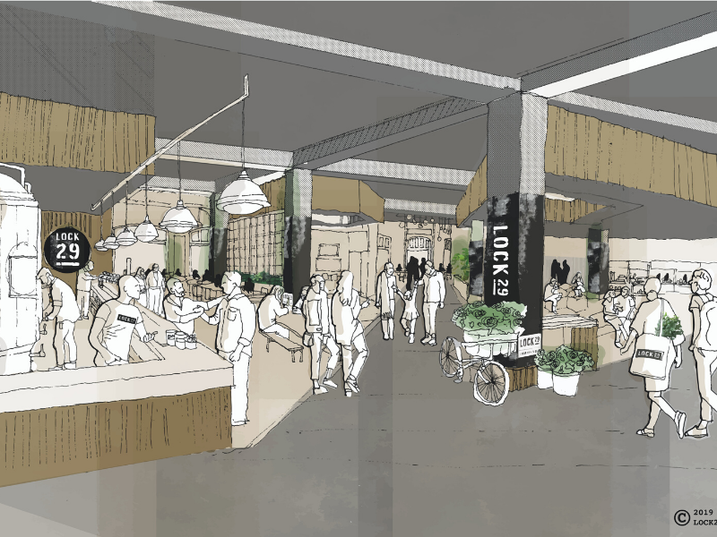
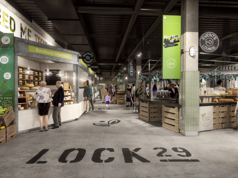
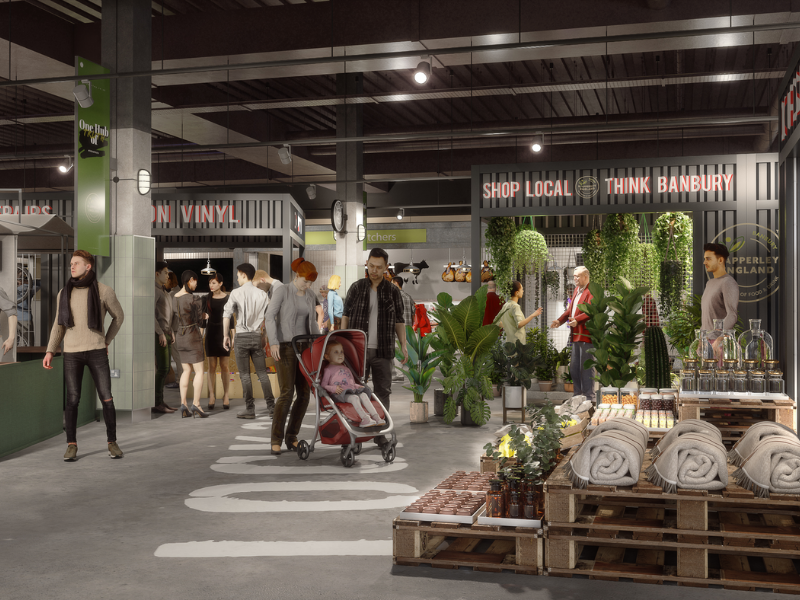
The spatial design for Lock29 has been developed to showcase the varied and vibrant industrial elements of the Oxford canal. The designers have worked closely with Marketplace Europe to provide units that will facilitate a number of small independent business types. Turnerbates’ design enables flexibility for traders at each stage of their businesses development and a vibrant retail mix for visitors and the local area.
The design rationale for Lock29 is that each unit type conveys a different texture of the canal; from the buffed and weathered steel which can be found along the textured walkways, the white washed timber remnant of the timber yards and canal side buildings, the trapezoidal sheeting found on shipping containers and chunky mooring rope. Turnerbates has designed a destination, where each zone has its own character and is flexible to grow and develop with the exciting future of the Lock29 brand.
Lock29 has been designed with the people of Banbury in mind, and will come alive when animated with community activity and local produce.

